PRODUCT / UX RESEARCH INTERNSHIP
Over nine weeks, I reframed an invisible back-office billing mechanism into a consumer-facing product that patients and dental teams could see, trust, and manage.
Timeline: 9 weeks
Process: Problem framing → Research → Discovery → Design → Testing → Handoff
Role: Product / UX Research Intern
75
participants tested
Unmoderated + internal staff sessions
3
features validated
Designed end-to-end and usability-tested
13
features scoped
Patient-facing + office-facing roadmap
CEO / CFO / CPO
executive audience
Full strategy, research, design, and roadmap

01 / THE PROBLEM
A payment arrangement is a handshake nobody can see.
Payment Arrangements worked as a financial mechanism, but broke down as an experience. Nine internal stakeholders and three dental offices described a system with thin trust, constant miscommunication, and no proactive contact before collections.
“
they are doing handshake deals and they are not getting paid.
CPO interview
60 months
Arrangements were stretched with no cap in sight.
40–50%
Of support tickets were patients asking what they owed or when payment was due.
56%
Of practices reported rising A/R days and manual follow-up.
02 / RESEARCH
Six moves across nine weeks.
I interviewed nine stakeholders across Product, Design, Support, and Sales, plus staff at a partner dental office. Then I paired the qualitative signal with a nine-platform competitive teardown and two rounds of usability testing.
01 / FRAME
Align on the invisible system.
02 / LISTEN
Nine stakeholders + three offices.
03 / MAP
Nine-platform competitive teardown.
04 / SCOPE
13 features, three prioritized to build.
05 / TEST
75 participants + staff sessions.
06 / HANDOFF
Strategy, decisions, and build-ready scope.
“
Patients are confused because they do not have a good understanding of how many payment arrangements I have, or which are past due.
PM interview
“
They are doing handshake deals and they are not getting paid.
CPO interview
“
Staff were tracking agreements manually, sometimes on sticky notes.
Dental office staff
COMPETITIVE RESEARCH
Three built. Ten more made legible.
The handoff did not stop at the tested screens. It documented a 13-feature roadmap, the competitive category around it, and the product decisions stakeholders had been circling for months.
03
Designed end-to-end + usability-tested
13
Patient-facing + office-facing features scoped





Competitive Research


Three decisions locked in stakeholder alignment
→
SSN / ITIN is entered once and carried through the entire flow.
Removes repeated friction and keeps the flow coherent.
→
Payment frequency aligns to the patient’s existing pay schedule.
Makes repayment fit the patient’s real cash-flow rhythm.
→
Term length is capped at 90 days, 6 months, or 1 year.
Closes the gap where arrangements had stretched to 60 months with no ceiling.
03 / DISCOVERY
Three gaps. One unowned moment.
The opportunity was not another financing product. It was the moment after a decline — when a patient still needs care, a front desk still needs a safe next step, and nobody else in the category takes ownership.
01
No patient dashboard
Every balance question became a phone call because no self-serve view existed.
02
No repayment signal
A propensity-to-repay model existed, but no interface had been designed for it.
03
No automated reminders
Accounts went silent until collections because proactive outreach did not exist.
FINANCING LENDERS
Approve or reject, then walk away.
0 / 9
own the moment after decline
DENTAL POINT SOLUTIONS
Approve everyone, then absorb the risk.
04 / DESIGN
Three features moved from signal to screen.
Each feature started low-fidelity, then tightened around staff feedback, accessibility, and the simplest possible next action.
01 / BUILT FEATURE
Propensity-to-Repay
Designed + tested
A staff-only 1–10 score, banded low / medium / high, used after a financing decline to guide the offer and deposit.
WHY IT MATTERS
Turns an invisible risk signal into a consistent front-desk decision without exposing the score to patients.
01 / BUILT FEATURE
Patient Status Dashboard
Designed + tested
A no-app, no-login view reached by text link, showing remaining balance, next payment, and full history.
WHY IT MATTERS
Replaces “what do I owe?” calls with a self-serve moment patients can trust.
01 / BUILT FEATURE
Automated Reminders
Designed + tested
Office-facing reminder and escalation settings with previewable message text and a clear on / off control.
WHY IT MATTERS
Creates a proactive repayment signal before an account quietly becomes a collections problem.
DECLINE → SCORE → OFFER
Risk becomes a decision aid, not a refusal.
TEXT LINK → VERIFY → SEE BALANCE
Reassurance without an app, login, or phone call.
CONFIGURE → PREVIEW → SEND
Automation with visibility and a clear off switch.
05 / TESTING & VALIDATION
The signal was strong enough to hand off.
Two rounds of testing combined 75 unmoderated participants with live sessions from internal staff. The scores show where the concepts were already working and where one more research loop was still warranted.
3.9 / 5
3.8 / 5
3.6 / 5
Patient self-serve dashboard
Very easy and user friendly to navigate.
Propensity-to-Repay usefulness
Would save time by reducing individual calls.
Readiness to switch on
Staff wanted proof that settings actually saved.
WCAG 2.1 AA + heuristic review
No critical or major blockers surfaced. Findings clustered around contrast, icon labeling, and touch target sizing — fixable at the design-token level, not through rework.
06 / OUTCOMES
Make the handshake visible.
By the end of the internship, WellFit had a validated product direction: three features tested, 13 features documented, the category mapped, and the open product decisions locked well enough for a team to build next.
1
shared source of truth for balance, due date, and next action
3
patient, staff, and office moments designed around visible repayment signals
1
clear pilot question: does repayment visibility change the offer and reduce support calls?
07 / REFLECTION
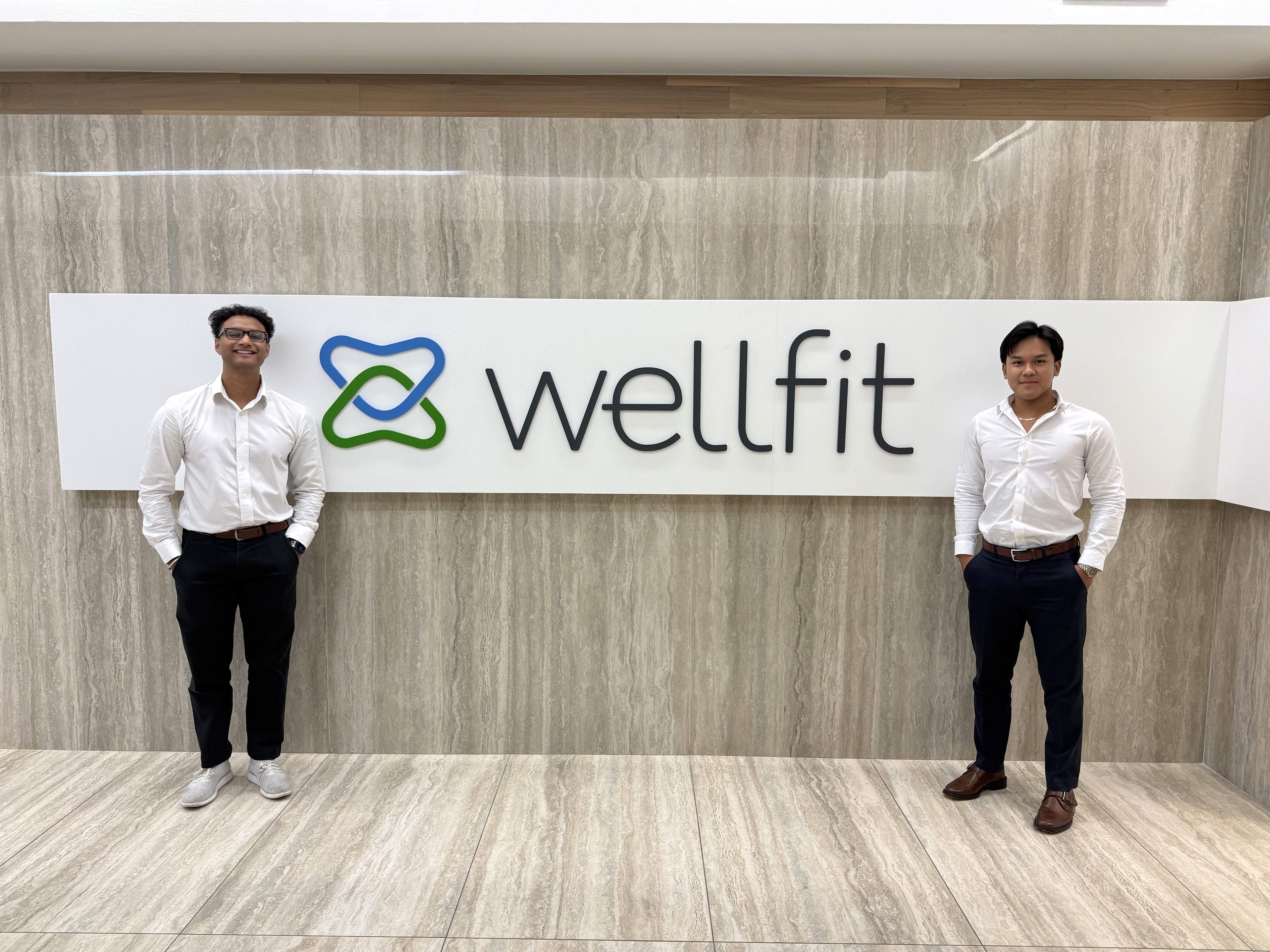
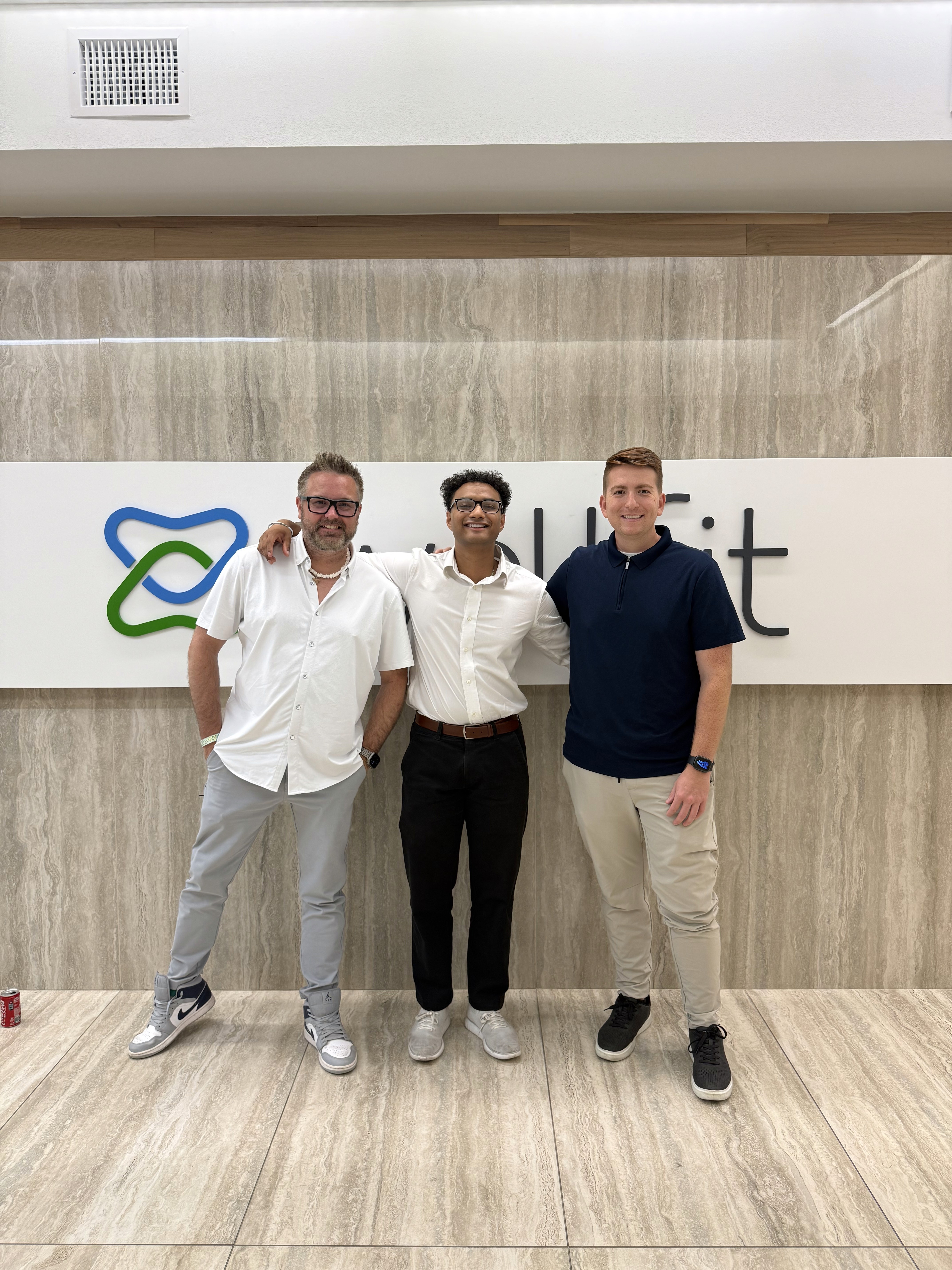
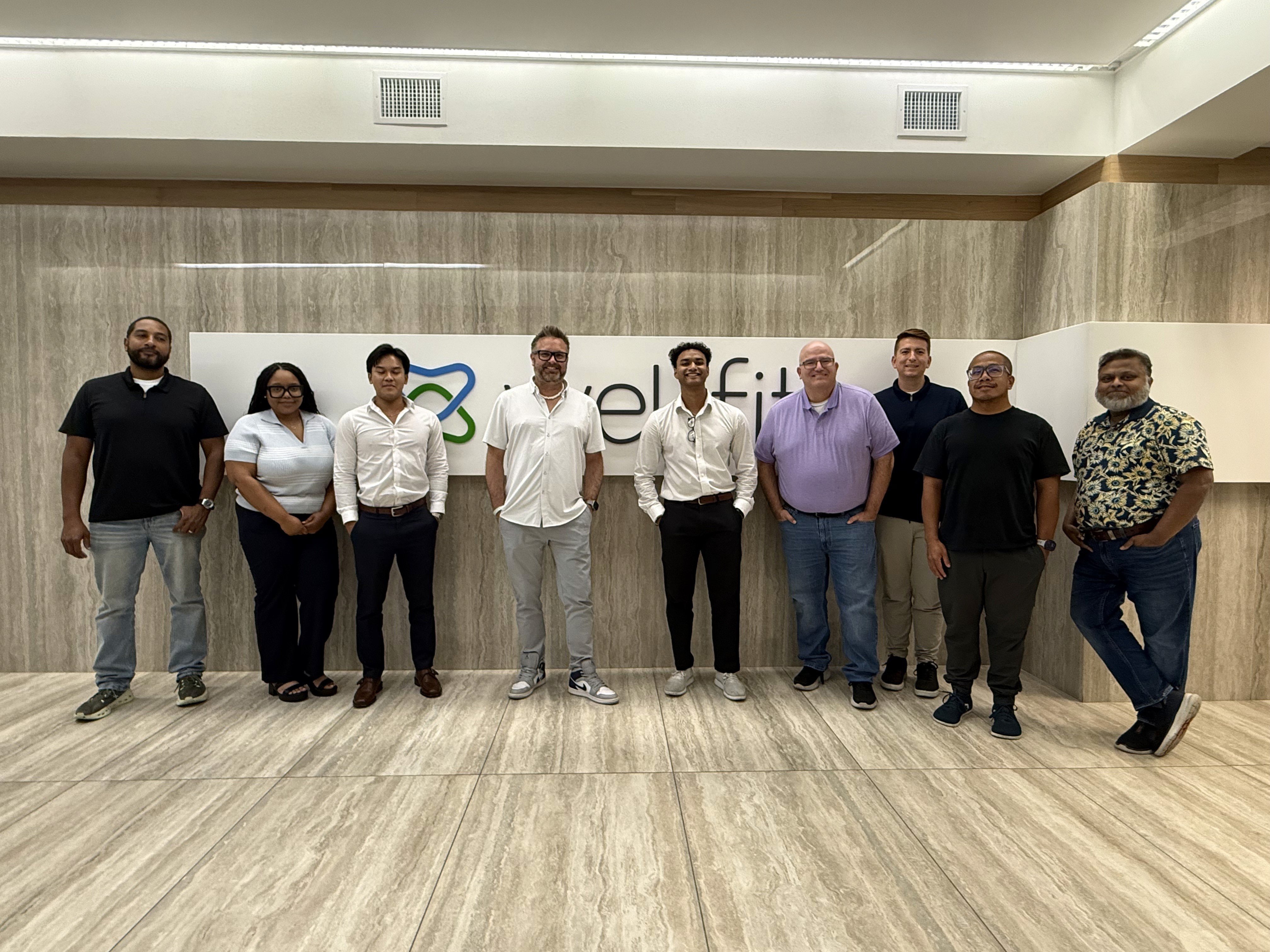
Coming into WellFit Pay as a Product/UX Research Intern, I was trusted to work across ideas at very different stages. Karey Crump made that trust feel safe from day one, while Johnathan Tebeau and Paul Little pushed me with honest feedback, checked in, and became genuine friends along the way. That mentorship changed how I see myself as a designer and creator; I left the nine weeks with more confidence, more clarity, and a better sense of the work and people I want to keep building with.
Sahil Malgundkar
If you want the full design process, let’s talk.
NEXT CASE STUDY