PRODUCT DESIGN · DESKTOP EXPERIENCE
Done Desk
Tracking continuing education is a quiet but persistent burden for dental professionals. License requirements live across certificates, hours, and deadlines, making it easy to lose track of what is complete and what still needs attention.
We designed a centralized CE tracker that turns scattered requirements into a clear, step-by-step routine—helping dentists see their progress, manage certificates, and stay ready for renewal.
Timeline: 4 Months
Team: Krish Parmar - UX/UI Designer, Ava Jiang - UX/UI Designer, Aayushi Prasad - UX/UI Designer
Tools: Figma, Figjam
Role: UX Research, UX/UI Design, Storytelling

FINAL PRODUCT
Context
No clear next step.
Done Desk brings licenses, certificates, and renewal progress into one place.
DESIGN PRINCIPLES
A
B
C
PROCESS
A
Three questions guided the work.
What needs to be visible first? What can wait? How can the interface make progress feel tangible?
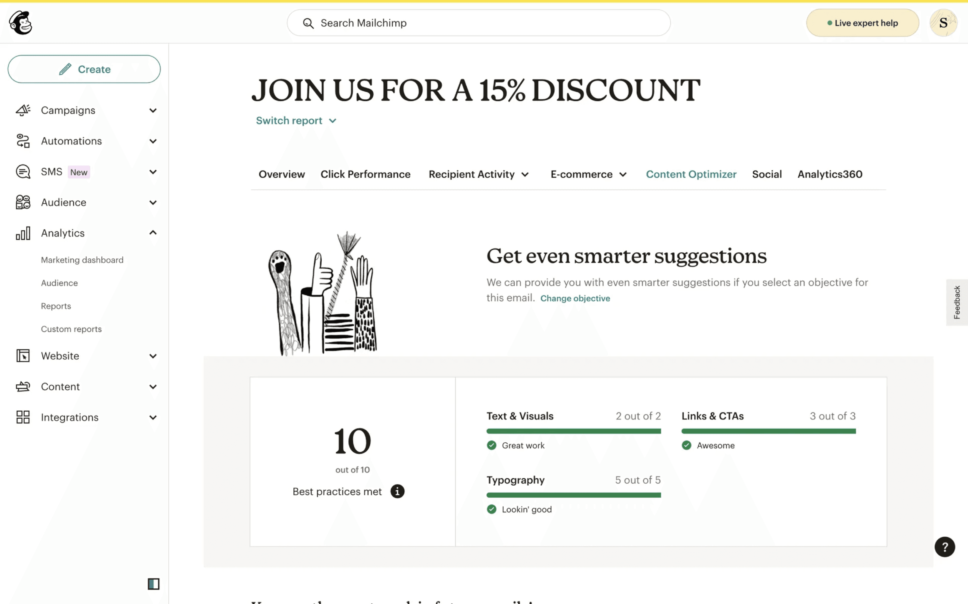
REFERENCE RATIONALE
We looked for progress patterns that feel immediate.
We used the UT Austin IDA and Mailchimp for brainstorming our management tool. We chose these tools because with each requirement, it has sub-requirements which is what we’re looking for in our management tracker.
RESEARCH
Competitive patterns
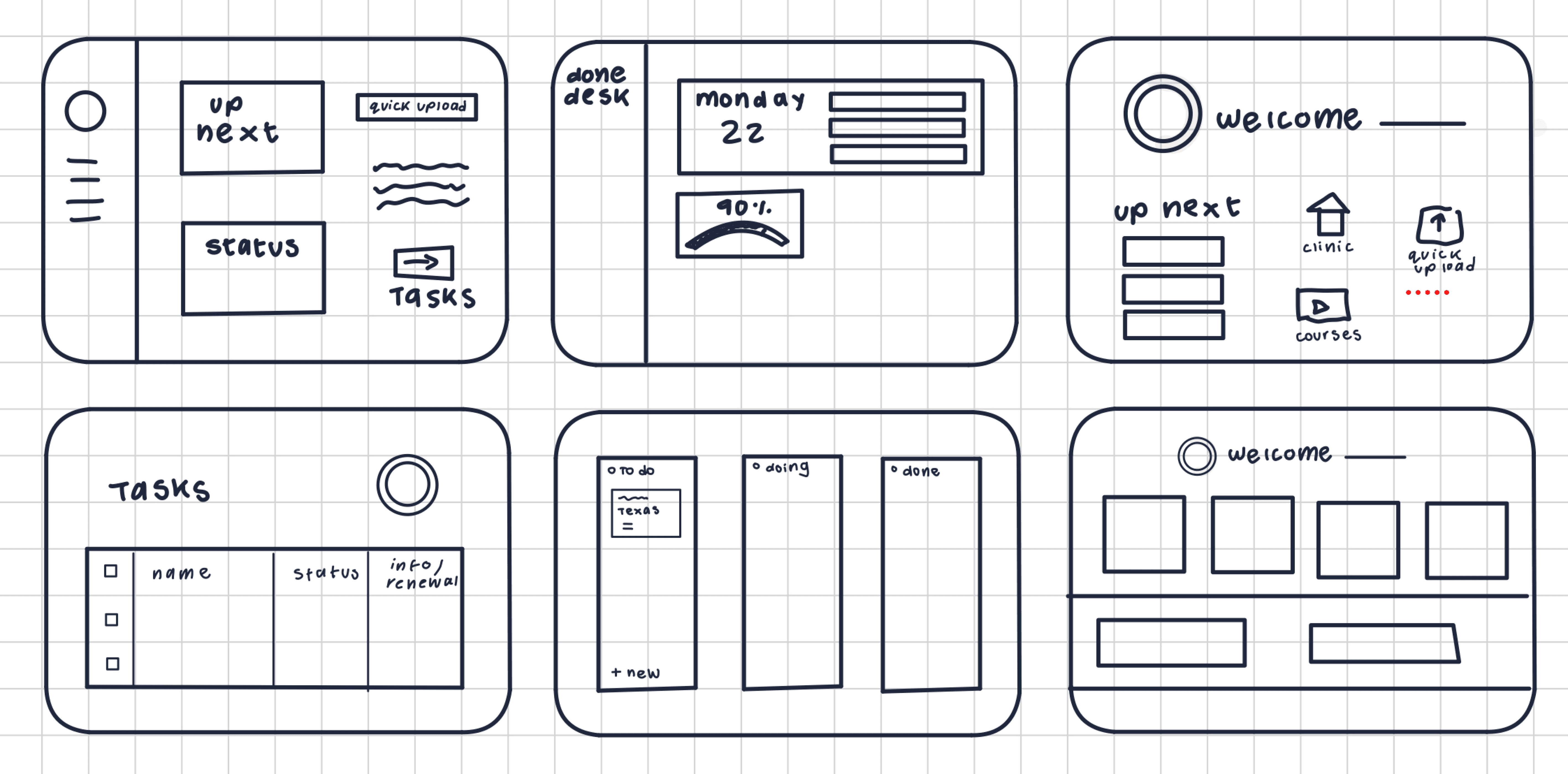
The strongest references made progress legible at a glance.
A
Progress needs a visual language.
Users should be able to understand what is complete before reading every requirement.
B
The next action should be obvious.
A clear hierarchy can turn a long list into a sequence of small, confident decisions.
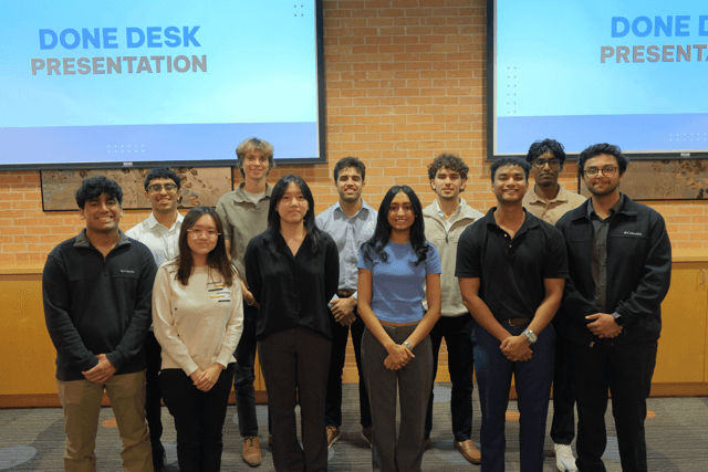
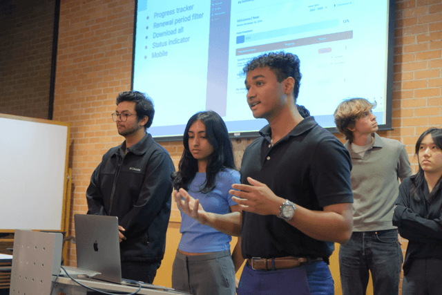
Sharing the work.
Reflection
This project taught me how much clarity comes from making the next step visible. Working across research, interface design, and storytelling helped us turn a complicated requirement into a routine people could trust.
This is just a snapshot of the entire design process. Reach out to learn more!
NEXT CASE STUDY


